Two-tone cabinetry has moved from trend to mainstream in Melbourne kitchens, and for good reason. Splitting the joinery palette lets you add depth and personality without committing an entire room to a bold colour, and it works in everything from Edwardian weatherboards in Northcote to new townhouses in Glen Waverley. Done well, the second colour makes the kitchen feel designed rather than decorated.
Done badly, two-tone joinery looks like an indecisive compromise. The difference comes down to placement logic, tonal contrast and finish pairing. This guide covers the combinations we see working in real Melbourne homes, the rules that keep them coherent, and the traps that date a kitchen quickly.
In this guide
Why Two-Tone Works: The Visual Logic
Single-colour kitchens rely entirely on benchtop, splashback and hardware for contrast. A second cabinetry colour gives the room structure by visually separating zones.
- Weight belongs at the bottom: Darker or stronger colours on base cabinets ground the room, while lighter overheads keep the upper half open and airy. This mirrors how we naturally read interiors.
- The island earns its own identity: As the social anchor of an open-plan space, the island is the most legitimate place for a feature colour or timber finish.
- Zone separation reads as intent: A tall pantry bank in a contrasting finish reads as a distinct piece of furniture, which suits the current preference for kitchens that blend into living areas.
Melbourne open-plan extensions particularly benefit, because two-tone joinery helps a large kitchen relate to the living zone rather than presenting one monolithic wall of colour.
Proven Colour Pairings for Melbourne Homes
| Combination | Where Each Colour Goes | Best Suited To | Benchtop Pairing |
|---|---|---|---|
| Deep green + warm white | Green base and island, white overheads and talls | Period homes, Hamptons-leaning and classic shaker kitchens | Light stone-look porcelain or marble-look surfaces |
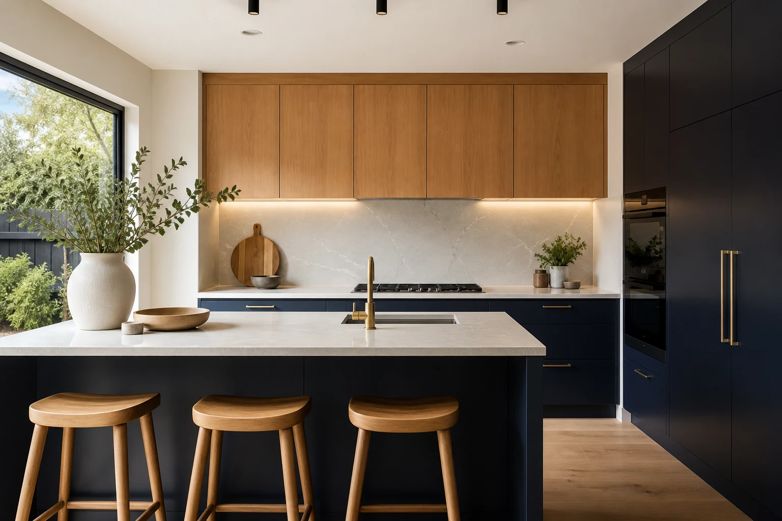
| Navy + oak woodgrain | Navy base, oak overheads or open shelving | Contemporary family homes wanting warmth without colour risk | White or pale grey tops with soft veining |
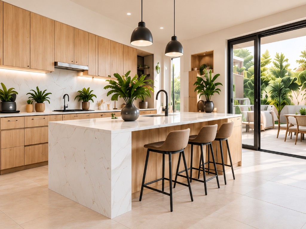
| Charcoal + light timber | Charcoal perimeter, timber island or pantry bank | Modern extensions and townhouses with good natural light | Concrete-look or honed pale surfaces |
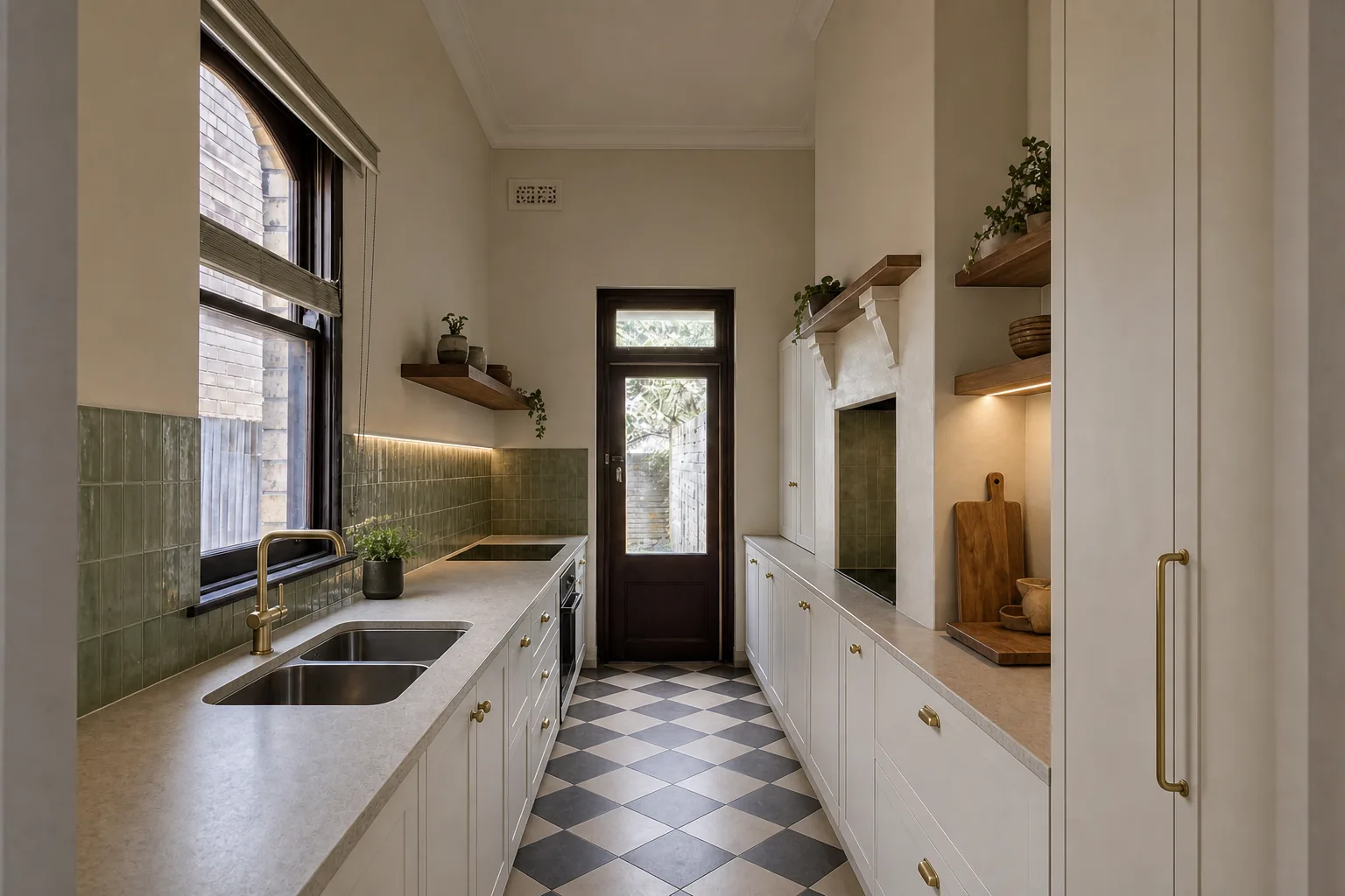
| Sage or eucalypt + white | Sage base, white uppers, brushed brass accents | Weatherboards and homes referencing garden outlooks | Warm whites rather than stark cool whites |
| Black + walnut or smoked oak | Black talls and overheads, timber base or island | Premium contemporary projects with generous lighting | Dramatic veined porcelain or natural granite |
Notice the pattern: one colour does the emotional work while the other provides calm. Two competing statement colours is where most two-tone kitchens go wrong.
Placement Rules That Keep It Coherent
The second colour needs a reason to be where it is. These placement rules hold up across almost every style.
- Break at a logical junction: Change colour where the joinery changes function, such as base to overhead, perimeter to island, or kitchen run to pantry bank. Never change colour mid-run.
- Keep talls consistent: Tall cabinets read as walls. Splitting colour within a tall bank chops the room visually.
- Limit the palette to two joinery finishes: A third finish is only safe when it is a subtle internal detail, such as timber open shelving within a white bank.
- Respect sightlines from living areas: In open-plan Melbourne extensions, the island and rear wall are seen constantly. Put the confident choice where it is seen, and keep working zones calm.
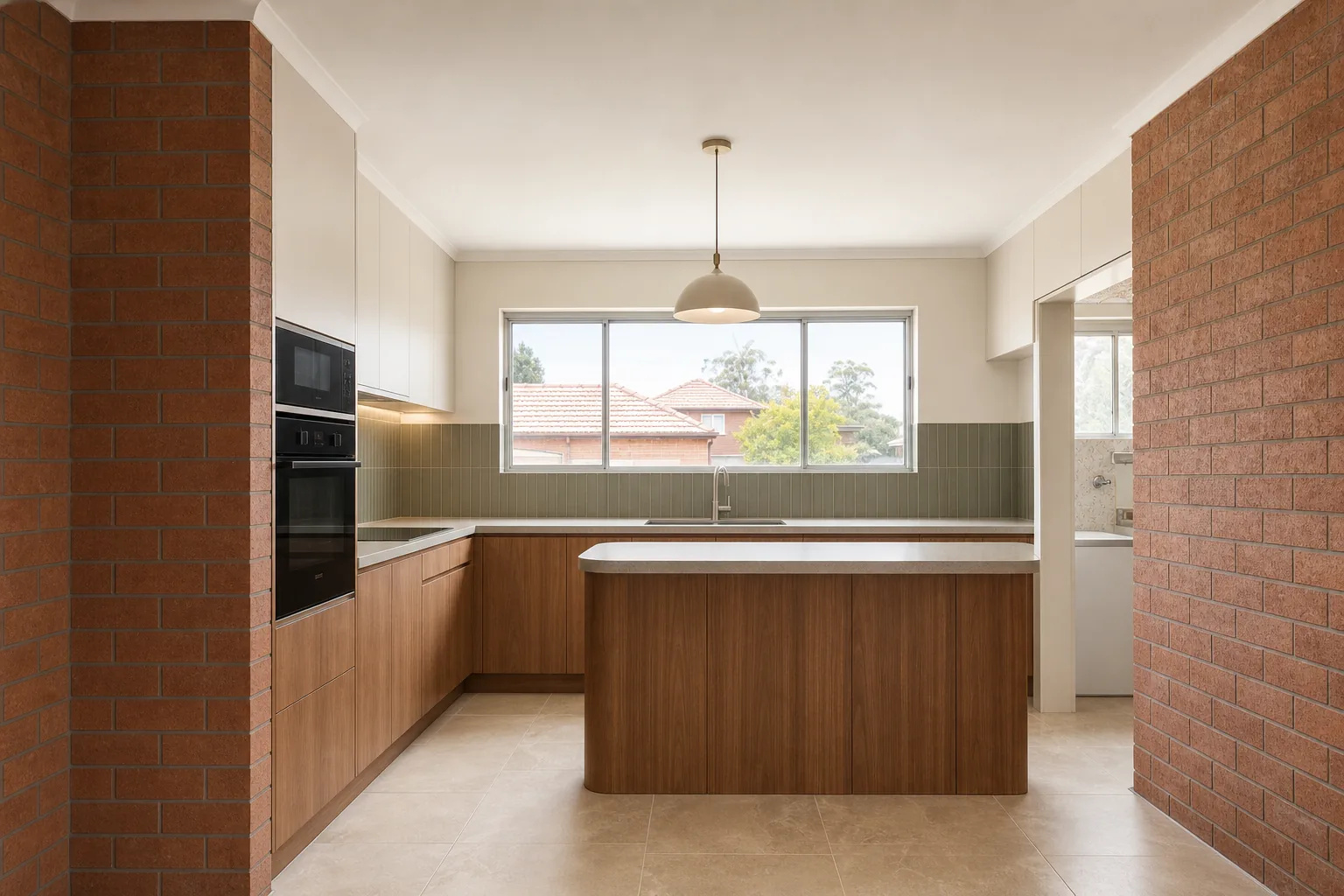
If you are unsure, the lowest-risk formula remains dark base, light top, feature island. It photographs well, ages slowly and suits resale.
Finishes: Matt, Satin, Woodgrain and Shaker Profiles
Colour is only half the decision. The finish system determines how the two tones actually read in Melbourne light, which is softer and greyer than the harsh light further north.
- Matt and super-matt boards: The current default for coloured joinery. Fingerprint-resistant coatings are worth specifying on dark colours, especially for families.
- Satin two-pack: Painted polyurethane allows any colour and suits profiled shaker doors, with a repairable surface. It costs more and has longer lead times.
- Woodgrain boards: Modern oak and walnut-look boards are convincing and stable. Run grain vertically on talls and horizontally on drawer banks for a deliberate look.
- Mixing profiles: Keep the door profile consistent across both colours. A shaker base with flat-panel overheads rarely works; change colour, not architecture.
Ask your joiner for large-format samples of both finishes and view them in the actual room, morning and evening. Small chips lie, particularly with greens and greys under warm LED lighting.
Hardware, Benchtops and Splashbacks Around Two Tones
Once the joinery carries two colours, everything else should support rather than compete.
- One hardware finish throughout: Brushed brass, matt black or brushed nickel all work; mixing metals across the two cabinet colours usually reads as accidental.
- Benchtop as the bridge: Choose a surface that contains undertones of both cabinet colours. A warm white top with soft grey veining ties navy and oak together effortlessly.
- Quiet splashback, or a third texture: With two joinery colours, the splashback works best as texture rather than colour, such as a handmade-look white tile, a continuation of the benchtop stone, or fluted glass.
- Kickboards: Match the kickboard to the base cabinet colour so the base reads as one grounded mass.
The test is simple: stand back and count the number of things asking for attention. In a good two-tone kitchen, the answer is two, and one of them is winning.
Common Two-Tone Mistakes That Date Quickly
We see the same handful of errors repeatedly when reviewing designs Melbourne homeowners bring to us.
- Fifty-fifty colour splits: Equal amounts of two colours fight for dominance. Aim for roughly two-thirds calm, one-third feature.
- High-contrast trend colours in fixed joinery: A bold colour is a ten-year commitment in cabinetry. If the colour is fashionable this year, consider carrying it in paint or stools instead.
- Ignoring the floor: Timber floors add a third warm tone. Charcoal plus oak joinery on top of yellow-toned floors can turn muddy; test samples on the actual floor.
- Feature overheads on a dark base-heavy room: Dark uppers with light bases inverts visual weight and makes ceilings feel lower, a real problem in Victorian-era homes with tall but narrow rooms.
- Forgetting appliance colour: Stainless, black and white appliances all read as a third finish. Integrate them or choose them deliberately.
Does Two-Tone Cabinetry Cost More?
Marginally, and mostly in specific situations. A second board colour in the same finish system typically adds little, because the joiner is cutting from two board stacks instead of one. Costs move when the second finish is a different system entirely.
- Two melamine or laminate colours: usually a negligible difference.
- Adding a two-pack painted island to a board kitchen: expect a meaningful premium on that section, commonly 40-70% over the equivalent board joinery.
- Adding genuine timber veneer as the second finish: priced closer to premium joinery and needs careful sealing near sinks and cooktops.
Where budgets are tight, spend the premium finish on the island only. It is the most visible element, the smallest area, and the piece guests actually touch.
Take these ideas with you.
- Put visual weight low: dark or strong colours on bases and islands, lighter tones on overheads
- Change colour only at logical junctions such as base to overhead or perimeter to island, never mid-run
- Keep one door profile and one hardware finish across both colours so the scheme reads as deliberate
- Aim for roughly two-thirds calm colour and one-third feature rather than an even split
- A second board colour costs little, but a two-pack or timber feature section carries a real premium, so spend it on the island
A few more answers
Questions about your next step.
How much should I budget for a kitchen renovation in Melbourne?
Budget depends on layout changes, cabinetry level, benchtop choice, appliance scope and trade complexity. Fixed-layout refreshes sit much lower than structural redesigns with new services.
What kitchen upgrades usually add the most practical value?
Better drawer storage, smarter appliance placement, durable benchtops, layered task lighting and a well-sized rangehood tend to outperform cosmetic-only upgrades.
How long does a kitchen renovation usually take?
Most kitchens run over several weeks. Cabinetry manufacturing, stone templating and trade sequencing usually matter more than the demolition day.
Put your ideas into a plan
Turn this cost guide into a real number
A useful quote names layout, services, finish level and exclusions. We measure in the house, then price the room you actually have.
Choosing cabinetry colours from tiny chips is how regrets happen. We design two-tone kitchens with full-size samples reviewed in your own light before anything is ordered. Explore our kitchen renovation design service.